Thursday 8 April 2010

Evaluation

1- In what ways does your media product use, develop or challenge forms and conventions of real media products?


Music Video:
In order to successfully develop the genre of Ska, whilst integrating it into my 3 productions, it was fundamental for me to research the genre in depth. My music video develops and uses the forms and conventions of Ska, and was influenced by several real media music productions. The first intertextual reference used in my music video is, Sum 41’s ‘In Too Deep’ music video. Sum 41 are a Ska-Pop-Punk band formed in 1996, and target their music to a youthful audience demographic, similar to ‘Smaller Than You’. To generate the genre of Ska I was influenced by the costume, mise en scene, humour and filming of their 2001 ‘In Too Deep’ music video. Although their video is generically high school American, we used generic signifiers to amplify the cultural roots of British Ska-punk, and to represent contemporary life in Britain. This music video uses generic conventions that reflect high street fashion of the Ska-punk sub genre, for example; sweat bands, Etnies trainers (distinctly associated with youth, skating and Ska) and iconic band merchandise, for instance the ‘Iron Maiden’ t-shirts worn by the guitarist, developing references to the underground metal/rock genre.

The performers in the narrative are generically white punk skateboarders (the genre ironically originates in Jamaica, yet the majority of Ska artists are white) seen in the mise en scene of ‘In too Deep‘: some with vibrant pink hair and tattoos, connoting a rebellious stage in youth, appealing to specifically 15-18 year old males (a niche audience demographic). These signifiers influenced the main characters in my music video, for example, the skateboarders in my narrative had tattoo’s and t-shirts referencing rock icons (The Aquabats, Guns and Roses) to give them the specific prototype for the genre. The cast members all wore Etnies and Vans which are part of the generic skateboarding attire worn by young males aged 15-19, and band merchandise clothing which connotes the appeal to Ska punk fans. This video linked with the slapstick humour of the narrative, along with the generic use of skateboarding, that relate closely with the genre.

I challenged the generic form of Ska by having female skaters and band members in my music video. Female musicians in Ska bands are quite rare (The Raincoats and No Doubt are exceptions) and the ratio of men to women is extremely higher, as the genre is masculinised, which is why I decided to promote and strongly represent females in my music video. ‘Smaller Than You’, the band I chose, consists of 6 members, one of them being a female, reflecting the dominance of males in this genre of the music industry. I wanted to increase market sales by including girls in the narrative to broaden their target audience. Thus we female skaters and cast members in the music video, to challenge this generic stereotyping, widening the gender boundaries in Ska music. Having females in this ska-punk music video adds a post-modernist element, and also develops ‘The Male Gaze Theory’, as audiences will view her in different ways, but, we mainly want the audience to view her from within and identify with her. This is significant as Lacans mirror stage theory states that audiences are subconsciously looking for their own mirror image to identify with, within the media, through similarities in the text. Here we have developed a text predominantly for male indemnification, but, have expanded our niche audience for females to be included.


The second media product that inspired my music video was Less Than Jake’s- ‘Does The Lion City Still Roar?’, music video. Less Than Jake are an American Ska-punk band, and like Smaller Than You, share the same fast paced Ska beat. This music video connotes Ska and urban scenes significantly and targets a youth audience demographic, through the use of props, genre and characters, so that this niche audience can identify more closely with the band. This is significant in developing Jacque Lacon’s theory where audiences look for their own mirror image to identify themselves with, in the media. I utilised this in my music video through the social realism approach, (youth, skateboarding, urban scenes, Britain) in order for our audiences to identify strongly with young British band. This is effective in targeting an audience as it enables the target audience to engage, for instance Kres states that genre is “a frequently repeated social occasion, with its characteristic participants and their purposes“, which makes them feel comfortable as they can identify with this lifestyle, social group, and culture, forming a collective group for them to belong too.

This ‘Less Than Jake’ professional music video primarily focuses on desolate contemporary urban landscapes reinforcing the genre’s punk underground roots. The locations in my music video were numerous city landscapes and derelict urban scenes in Norwich’s inner city, linking to British social realism, for instance the grim and desolate scenes in’ This Is England’, immediately signifying the distinct culture of the band.


This social realist film was crucial for my research into the production of my music video, as it conveys and generates strong messages on culture, the importance of the British punk music scene and significantly utilises genre, through costume, location and characters. My music video develops solidarity and creates a collective group, for young people interested in skateboarding and ska/punk music, but it also subverts these British social realist films such as ‘This Is England’ and ‘Fish Tank’ which entail youth alienation, seclusion and crime, which portray British youth in a negative light. Bands associated with this genre also symbolise and reflect British culture through their music video's and lyrics, for example, The Specials-'Ghost Town' entails the band in a utpoic run down urban city, which links to their political lyrics of unemployment caused by Margaret Thatcher, linking to the strong political issues in 'This Is England'.

The narrative of ‘Less Than Jake- Does This Lion City Still Roar?“ symbolises urban scenes along with up-beat filming, which are both associated with the genre of Ska, therefore inspired my production of ‘Smaller Than You- Who Knew’. The genre of Ska generically uses a non linear narrative, focusing on integrating band performance with a slapstick comic aspect as seen in Both these music videos, which I incorporate in mine. The humorous narrative entailed in ’Does The Lion City Still Roar?’ was significantly developed with the use of voyeurism from the sunglasses.


This fashionable prop is enticing, developing an active audience, creating demand. The slapstick sequences in my production involves the constant switching of drum sticks through skateboarders and the band members, injecting the mise en scene with playfulness and energy. These drum sticks were a fundamental prop to the mise en scene as they were the focus of the narrative, enabling it to be significantly developed. Other props we used were the skateboards and a car, which were effective in connoting and reflecting the fast paced melody and the lyrics from the song, for instance, “run from the light“, “actions“, and words of transition and movement. Other phrases from the lyrics of Who Knew‘ we utilised were focused on “the hassle of life“ and “in the minds of the young”, referencing what its like for young people to grow up, reflecting the messages conveyed through my production. This is significant in conforming to Goodwin’s theory in which music video’s should have a strong relationship between the lyrics and the visuals of the text, therefore illustrating the song through the video‘s amplifying its messages through the communication of the production. I was influenced by Less Than Jake and Sum 41’s bright grading in their videos. I kept the lighting ambient and vibrant to reflect the upbeat pace of Ska, to emphasise and reflect the significant speed and cut of our fast edit. The costume in this video, also like Sum 41, connotes the genre significantly. The use of Vans shoes on the main cast members is a generic convention of the genre. This reinforces the youthful music and reflects the urban sport, as this type of clothing is associated with the generic blueprint of punk, Ska and ‘indie’ personas, thus being recognisable to fans of the genre and sport.


2- How effective is the combination of your main product with ancillary texts?
Digital Pack And Magazine Advert
:

To connote genre further in my print productions I researched many independent and mainstream Ska, punk and reggae artists. The reason I explored reggae artists was because the roots of Ska originate from reggae and their influences. Although my music video develops and uses forms and conventions of Ska, my digital pack challenges them. I was influenced by Vinyl as it presented the music authentically injecting the package with a sense of vintage classiness, as well as used by contemporary DJ’s. I explored Reggae vinyl such as Studio One as they are amongst the first to record Ska on their record label. ‘Studio One Ska’ is one of their compilations which conforms to the generic Ska form, appearance and signifiers. This consists of : Bold eye catching font, extreme contrasting colours, repetitive images and humour. As appearance was everything, I tried to produce a product that fits the generic Ska prototype, whilst integrating aspects of youth culture.


The Specials were primarily significant in my research as they integrate a band style that relates to their music and image. I used their motif of recurring images, themes, and prints throughout my digital pack to connote and reference Ska. My front image of my digital pack was a close up of two cast members holding the skateboard and is cut up and mirror imaged. I developed this style by manipulating images from the music video throughout the production to reference the video itself. These images I cut up and amplified on Photoshop and created a layout, a lot like The Specials to generate the genre of Ska. I was intrigued how their style was mirror imaged and how that related to their ‘2 tone‘ record label of doubles and tones (black and white). I kept the foreground extremely simple like the specials and then integrated bold colour with an eye catching font. The Special’s font and logo was extremely significant as it was memorable and humorous, reflecting their music. The 2 Tone band kept their costume and style significant in relating to the genre and linking with their products appearance. For my front cover I wanted to achieve this. I took a still image with my SLR camera of two cast members who resembled most, Ska music. I took a picture of them holding their skateboards (from the music video narrative) and manipulated it to appear like a mirror image. Their costume was generically Ska and targeted a youthful demographic, for example, tattoo’s, a guns And Roses t-shirt, on front of a urban scene attacked with graffiti. This, along with the use of the narratives main prop, added to the devolvement of genre on my digital pack.


The combination of integrating the same brand style and appearance through my 3 productions was extremely successful. My music video significantly conveyed and amplified messages of contemporary Britain, youth, and urban culture. I tried to utilise and capture what its like for young people living in contemporary Britain, and convey what these young people are interested in (music and sports), instead of crime. This was significant in contrast to the British social realist film, ‘Fish Tank‘, which focuses on alienation and deviance, whilst ours focuses on a more positive representation of youth as high spirited and full of aspiration. I thought skateboarding was an effective idea as it a diverse democratic sport undertaken by both the affluent and impoverish. The location of my 3 productions were in inner city urban areas which was extremely significant as it signified the underground music and it’s audience. I integrated this style into both my digital pack and my magazine advert. For my digital pack I wanted to promote the music and band but, also the music video itself. I thought it would be interesting to have snap shots taken from the music video so the products came together as a package. This meant that my target audience were likely to buy the vinyl, then watch the music video, or vice versa, increasing the bands popularity and awareness. This was extremely important as the brief was to promote an unsigned band, and the more desirable the product, the better the sales.

My vinyl package:
Front Cover

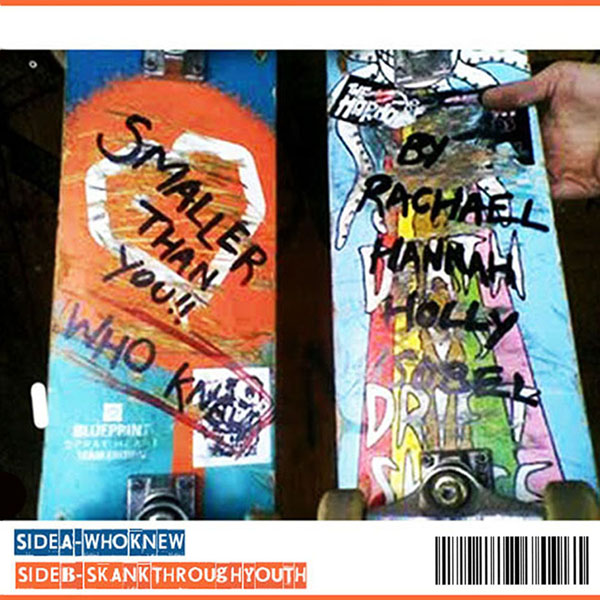
This front shot I took whilst filming the music video as I thought it would be effective for the promotion of their single 'Who Knew‘. My front cover resembled the music video’s ending, with the two main skateboarders finalising the narrative with an extreme close up of them holding their skateboards and walking off either side. I wanted to accomplish this closure of the music video onto my digital pack, like the end of a theatrical performance. I used the same derelict location with the graffiti background to utilise urban scenes as important in the genre of Ska. There is strong rebellious aspect to Smaller Than You’s music which I wanted to convey through this product. The bands style is extremely bold, fast paced and expressionistic, which I developed through the use of bold colour. I created the brand style of contrasting orange with blue from the colours in the skateboard so it wouldn’t clash with the fusion of colour in the image. I tried to develop the theme and style of urban scenes also through my magazine advert, subverting urban youth rebellion and reinforcing aspirational teenagers full of passion (music and skateboarding). The advert was of the release of ‘Who Knew’ on front of a brick wall which emphasised the culture of their music to their audience. I wanted this image to be striking and eye-catching as it is the image and idea the audience are presented with, therefore had to be effective.

Inside Left

This shot was directly taken from my music video in Norwich’s renowned Sound Clash. Sound Clash is Norwich’s best music store for reggae, punk, Ska and underground music which was significant in connoting independent British music in my music video. It adds to the brand style of utilising how significant music is in young people’s lives and how it is their passion. The ‘Studio One’ Vinyl Sam (the trumpeter) is holding is significant as it is promoting a generic Ska image. The cover is extremely bold and full of contrasting colour and conveys the liveliness and attitude of the music. I wanted Sam to hold this in the scene as it is an intertextual reference to the genre that inspired my productions. I wanted the band to recognise the brand style and name of the band instantly and resistively so I creates this vibrant orange repeated logo to develop this.

Inside Right


This image is what the audience will immediately see when they open up the case of the vinyl. I wanted this to be full of attitude to convey the rebellious underground aspect of contemporary Britain and the messages of growing up ‘Smaller Than You’ want to convey‘. This developed the brand style again through the use of the brick wall, emphasising an urban atmosphere connected to youth. This image is of the bass guitarist, jasper, who also features in the music video, linking these products together. This image conveys youth in contemporary Britain and the grim side of growing up with the temptations of ; drugs, alcohol, crime, giving the young audience something to relate to. This is significant in the idea of my music video developing a collective group, rejecting these temptations and alternatively including themselves in an active group entailing athletics and music to identify and cultivate with. Although this image could see threatening it is a mockery and is tempting youth in to listen to their music and reject this type of behaviour.

Back Cover

The back cover of my vinyl, again, combines visual aspects of the music video. Throughout my digital pack I wanted to reference skateboarding as significant, as it’s an important hobby shared by the band. I think this was significant in creating a brand style as it allowed the audience to see the real artist, almost like a day in the life of them, allowing the audience to see and relate to this passion, voyeuristically. I used the skateboard which was featured in the music video and wanted to capture the boldness and creativeness of the skateboard itself, symbolising youth as creative and talented as this sport quite artistic and each skateboard is unique. For the digital pack I referenced the music video by drawing on the skateboards the artist, the title, and the directors and producers of the video. This was significant as it almost conveys behind the scenes of the music video, enticing the audience.


3-What have you learned from audience feedback?

Music video:
My classmates filled in a questionnaire of feedback of our music video in order to develop my understanding of my audience’s perspective, instead of my groups. This is effective in developing a strong production, as our audience are our main focus so it enables our production to become more skilled, effective and professional. This type of research method used was qualitative as it was opinion based and entailed dichotomous, multiple choice and likert questions, developing a diverse questionnaire for effective and non-bias feedback. The demographic was a year 13 class of nine participants: four males, three of who are 18 and one of 17, and five females four who are 17, and one who is 18. This was effective as this is a youthful demographic, with some who are considered adults with a range of opinions. Interestingly the classmates are extremely different, varying from different collective groups: Emo’s, trendy’s, geeks, social ‘outcasts’, popular people, and chavs. This was significant as each and every participant were individual through their clothing, personality, interests, and particular group they belong too, developing unbiased and varied feedback.

Questionnaire: (below is the questionnaire filled out by a classmate)

Questionnaire Results:

Males- The males overall rated our video at 5, which is the highest and seemed to prefer it to the females who answered. This was interesting as our target audience is primarily males, thus meaning our music video was successful in targeting males. All the male participants found no offence or element of our production confusing, compare to females. Three males answered that our production was the ‘correct length‘, and one answered ‘I don’t know’ meaning overall the length was perceived as correct. This was interesting as our group did feel our production was long, as the song and music video itself was 3.39 running length, when generically from research into music video’s they are 3 minutes long. Three of the male participants said they would like to watch it again, which was a success as this music video is significant in promoting the band to their niche audience. The males predominantly rated 5’s (5 being the highest) for the standard of mise en scene, the overall enjoyment of the video and its quality of keeping them engaged, which significantly shows the proficiency of our video, according to young males in these certain areas. This is interesting as we wanted the mise en scene to be injected with engagement, through the characters, costume and props, and double narrative, which from this research was successful. The area’s which the male participants thought our video was weak in was how the end scene of Jake drumming was out of sync with the music, which we had noticed before but could not re-capture this certain scene, so had to adapt and conceal through editing. Others were that they hated the genre of ska, and wanted more ticks intervened in the narrative, but commented on how these tricks of the skateboarders were effective and good to the mise en scene, illustrating that our male audience is interested in skateboarding which may have added to their enjoyment and identification (mirror stage) with our production.

Overall the males seemed to enjoy the skateboarding aspect primarily as it kept their attention, and engagement on the screen. They commented on how our music video reflected the style of music significantly, which was are overall aim in developing the genre for our target audience to identify with, enjoy and be able to distinguish immediately. The males also answered ‘Yes’ for our production promoting the band which is effective as it enables them to se the band, view their passion and identify them for extra promotion.

Females- Females also in this questionnaire, commented on how the drumming towards the end could have been more in sync with the music, which shows how we could have improved the entire appeal and target audience (females) by cleaning up this section, which is a strong area for improvement in our production. The females answered higher than the males in the standard of the edit, mise en scene and enjoyment of the video, showing ho females are also interested in this video, but maybe not for the music: but for the style, and whole production, including continuity and the content of the narrative. This is interesting as this female feedback may have been different if Alice wasn’t featured in the video and women weren’t advocated in this genre, as they may have been offended fro the lack of femininity in this male dominated genre and band. One female participant answered that the video as too long also, so for further improvement we would consider the length of the video to enhance it’s appeal and enjoyment to the audience. The females interestingly found elements confusing, unlike the males connoting how it appealed less to them. These elements were; the shot of Alice, Sam and Rikk in Sound Clash and the significance of the drum sticks in the narrative, which was one of the most important parts in the engagement in our video. This significantly develops the idea that our video engaged more with the males as they could identify with the narrative and seemed to enjoy the slap-stick comedic effect, thus reinforcing our predominate target audience. The females predominantly enjoyed the skateboarding skills of the skateboarders and the effect and standard of the edit, showing how each gender look at elements of music videos differently and like certain aspects more than others.

This questionnaire was significant in illustrating what each gender look for in music videos, and how young males were our predomiant target audience.

Print productions:
For my vinyl package and my magazine advert feedback I asked 10 participants, 5 females and 5 males of my target audience demographic (young and interested In ska music) on their opinion of my print productions. The females found my vinyl package, overall appealing and vibrant, reflecting the upbeat genre of ska, but found the panel of Jasper smoking threatening and offensive. This was interesting as my aim was through this panel was to attract the audience whilst subverting youth crime and rebellion, by, creating almost a mockery through this image. I think this is a fundamental element for improvement in making my package more appealing to my niche audience. Females found my magazine advert appealing but quite masculinised, developed by the format and style of the a5 advert. Three of the females said that the font was eye-catching and significantly reflected the upbeat style of the band and genre, whilst the males didn’t think that most of the font and font style was eye-catching enough. Both gender’s thought that the actual product itself was significantly promoted as it was the central focus and was easy to establish as a product being sold/promoted on an advert. Two of the females commented on how the bottom right picture of jasper on my magazine advert, should have been an image of him looking towards Daniel Tuffs to carry on the pattern between the band members/skaters on the advert. Four males rated the advert at a 3/4 (5 being the highest) and three females thought it was a 3. All ten participants said how they thought the advert reflected the ska/punk genre and thought the use of urban scenes in the background was good in relating to the music video and vinyl package.

The negative elements commented from the males were how the two images of Daniel and Alice were of a different location to the bottom too (the bricks), and would have been much better if they were all the same. Both the genders again thought that the advert was eye catching and would be extremely eye-catching in Outline ( my chosen magazine) and would grab their attention. Males stated that my front cover was the best out of each panel, which is effective as it is what my audience are first presented with, and, said how the format of it being vinyl enhanced it’s appeal significantly. Females stated that the front cover was a bit too simple, and they couldn’t read the writing on the skateboard well enough, but, felt the mirror image effect was creative and good for its sales. Both genders stated that my images were out of focus and seemed pixelated, which is something I would need to work on for improvement as it effects the whole package altogether.

Males predominantly like my print productions better than females which is significant as I made these products with my young male target audience in mind, which shows these were successful I targeting the right gender.


4- How did you use media technolgies in the construction and research, planning and evaluation stages?

Blog:
My media blog was extremely useful and significant as it allowed me document, analyse and research all aspects of production. As technology availability is increasing and proliferating, the internet, especially, is becoming extremely useful in certain areas. I found my blog crucial as it is the one fundamental element of all 3 of my productions. This type of mass media intermedial text permitted me to add; videos questionnaires, graphic, graphs ,scanned images and even comments to give depth into my findings and progress throughout the practical aspect of my course. It enabled me to primarily research into both the genre of Ska (for my music video and print production) and the thrillers (for my thriller opening) giving me a basis of documented information to look back on, without obtaining files which can easily get lost and damaged.

As research was the most important aspect behind my productions this was extremely useful. After my research into the genre, my blog gave me the freedom to be able to have specific sections I wanted to target. There are many stages when developing a production and the tags provided on my blog, enabled me to section each post to its specific group. This not only broke down the stages of producing a real media product but wil be useful when revising for my written exam. I recorded all types of my independent research into genre and my audience demographic of Smaller Than You.

Aspects of planning the products were crucial on my blog as it allowed not only my group, but the cast members to be able to see filming schedules and the latest footage. After each day of filming I found my blog useful in acting like a journal, enabling me to reflect on my day, how effective the filming was and what improvements could be made. This helped my group in looking back in what we may have missed out or what could develop our music video further. As my blog was accessed via the internet it enabled me to be able to take images and information straight from social-networking and professional sites, giving me reliable sources. For my print productions my blog helped me evaluate each draft and idea and allowed my teachers to comment online which was a more effective way to mark work. In addition to this as it‘s mass media, public views and comments weren’t restricted enabling feedback from audiences and media consumers, developing stronger depth in my work. This type of technology wasn’t time consuming and developed my progression over the course, primarily in the construction, research, planning and evaluation stages.


Music Video:
Technologies were extremely useful in shooting and creating a professional finish to my music video. The camera my group used was a Canon Mini Dv and was the sacred element of our production. The tripod we had to film with was extremely useful as we had to vary our shots effectively, but also keep the filming steady giving it a clean professional appearance. The tripod also had a handle which enables us to position the camera at a certain angle without movement (which was safe) adding to the variation of shots. We could position the tripod to extremely low down, and vice versa which prevented us dropping or damaging the camera. The camera was extremely good at recording diegetic sound which was a positive and a negative as we sometimes had higher pitch levels than normal, especially with the skateboarding.

Post production was extremely important in our video as it covered up the errors and related the pace and style of the edit to the pace and style of the music. Adobe premiere Elements was the software I used and had numerous effects to make the video more enticing. This stage of the production was important as it needed to be skilled and effective in order to be desirable to the audience. As the genre of Ska is extremely fast paced and energetic we wanted to keep the cut fast and clean, presenting our double narrative effectively. As we had a non linear narrative which was performance based integrated with a slap stick comedy we needed to be able to shift from one to another rapidly, without looking cluttered and messy. To achieve linking the speed of the song with the edit we found cross-dissolves extremely useful. This effect let use interweave two completely different shots at the same time and gave it a certain quality. Without the cross-dissolves our shots were plain and simple, but we found it interesting to merge, for example, an instrument with a skateboard trick. Although this was intricate, and could have been a disaster, it was extremely effective. Developing this idea we found another way of endeavouring and conveying speed. This was through cutting out certain clips up and take out every other one. This created a comedic effect which we used, for instance, when someone was skateboarding down a hill from top to bottom and the shot was too long, so, by taking out every other interval it gave less un-useful footage and was humorous in creating a comic flipbook book effect.
(below: an example of a flipbook)


We also utilised speed by fast forwarding some of our footage. We used this to fill in gaps in our video and to give variety to the location, conveying to the audience that time has changed in the narrative. This was useful as we started off our narrative in an extreme bright atmosphere and finished it at night so we needed a clip which would be able to show the transition from day to night. This editing software came in useful when we had footage of a cast member running which was faster than the rest, and used this software to manipulate the speed to fit with the rest of the footage to keep continuity. The grading of our music video needed to be amplified and vibrant, due to the genre, and this programme enabled us alter whether it was higher or lower. This is significant as when editing my thriller we needed a lower chiaroscuro grading due to the generic conventions of the genre. The hardest element in post production was to sync the music with the clips of Smaller Than You’s performance. As there were 6 instruments to be filmed this was specifically hard but challenging as we wanted to film all instruments playing the music I the video. This was crucial as in order to have a successful product their needs to be a high standard continuity.

Print Productions:
For the production of both my print productions I used Adobe Photoshop to manipulate and enhance each image’s appeal. For my front panel of my vinyl package I took images on the set of my music video to use. I really liked the last scene of my music video which was where both Chris and Ross held their skateboards and walked off each side of the camera, revealing the graffiti backdrop. I thought this was significant in establishing youth through urban scenes and rebellion, and created a good division through the picture. I cut and cropped the picture in half too form a mirror image, like the style of ‘The Specials’ but subverted as its vibrant and full of contrasting colour. This image was taken on my mobile phone- Nokia E63, which is maybe why the image is quite pixelated, which is a negative aspect of this image. I changed the resolution on Photoshop of this image smaller to make it les blurry, which was reduced but still remained like this. This type of technology was fundamental in developing an effective image as it allowed me to take a basic image and manipulate it into a professional product. I changed the contrast of each image on Photoshop to reflect the vibrant style I was endeavouring, and also downloaded my own font into Photoshop to develop the bands own individual style. For my inside right panel of jasper I added a lens flare to make it eye-catching and more effective for the audience, which also conveyed the sense of a vibrant atmosphere also. For jasper’s image I added (through highlighting tools on Photoshop) a small beard too signify the stage in youth of growing up and to reinforce his masculinity. The burn tool was extremely useful to my print productions as it allowed certain areas to be highlighted and darkened, for example a lot of the writing on my productions was not clear, and this tool illuminated it making it readable to my audience. For my magazine advert Photoshop enabled me to layer the image so that I could easily move around and change the position and style of the image easier. This type of technology was extremely useful as it allowed me to be creative without drawing, but with skills and taught me how to develop something into looking professional and effective. This was also significant as I could save as many copies as possible and it was not as time consuming then drawing.

Friday 2 April 2010

Revison- G325

Question 1
Key Words:

Audience Demographic
Mise-en-scene
Intertextual References
Binary Opposition
Generic Conventions=Genre
Narrative
Post Modernism
Ancillary texts
Idealised
Linear/Non linear
Generic
Utilise
Convey
Connote
Social Realism
Continuity
Ambient/Non ambient
Diegetic/ Non-Diegetic
Hybrid
Blueprint
Misogyny
Denouement
Equilibrium/New equilibrium
Enigma/Ambiguity
Femme Fatale
Canted Shot
Chiaroscuro/ Noir
Ideology
Voyeurism
Niche Audience
Democratic Sport-Skateboarding

Key Theorists
Laura Mulvey- The Male Gaze
Jacques Lacon- Mirror Stage/identification
Goodwin Theory- Music Video’s
Kres
Todorv


References:

Soundtrack
Richard Straus- Last Song


Social Realism:
‘This is England‘
‘Fish Tank’

Slapstick:
‘Laurel And Hardy’
‘Keystone Cops’

Music Videos/Artists:
Less Than Jake- Does This Lion City Still Roar?
Catch 22- ‘Point The Blame’
Sum 41- ’In Too Deep’
The Specials- ’Ghost Town’
Made Caddies
Spunge
The Raincoats
No Doubt
Nike SB-’Today Was A Good Day’
‘Africa Shox- Left Field- urban location

Films To Reference:
‘The Godfather’
‘Kill Bill’
‘Jackie Brown’
‘Fight Club- Marla Singer’
‘Double Indemnity’- femme fatale GQ/Loaded/Nuts
‘The Third Man’- Anna (ff) survived -challenged genre Cosmopolitan/ELLE
‘Thelma And Louise’
‘Seven’
‘Pulp Fiction’- Mia
‘Scarface’- Drug references
‘Psycho’
‘Lady Macbeth’
‘High Planes Drifter’- Todorovs narrative theory


Question 2:

Key Words:
Apparatus-routines that influence us
Semiotic Struggle-trying to make meaning of us
Mediated- we shape ourselves through media
Ideology
Discourse
Identification
Disneyisation
Hegemony
Binary Opposition
Scopophilia
Homogeneity- everything the same
Heterogeneity- different elements
Collective Identity
Collective Reality
Solidarity- Glee/Female Magazines
Diversity/Plurality
Unified
Ideologically determined roles
‘Phallic Certitude’
‘Constructed Certitude’- constructing identity
Silent exclusion
Discourse
Celebrating difference
Collective groups
Ressert

Key Theorists:
Laura Mulvey- The Male Gaze
Jacques Lacon- Mirror Stage/identification
Angela McRobbie- we have become enslaved to capitalism
‘False Sisterhood’
‘Cult OF Femininity’
‘Crisis OF Masculinity
‘Consciously cultivated female bond’
Hypodermic needle theory

References:
Glee
Skins
Will And Grace
Gay Times
GQ/Loaded/Nuts
Cosmopolitan/ELLE
Bowery Boys
Fish Tank- Social Realism
Madonna- Vogue Lyrics

Tuesday 30 March 2010

Narrative Mock

Exam Mock:
‘Discuss the ways the narrative of one of your productions enhances it’s appeal’


The brief of a2 production was to promote an unsigned band through the production of a music video. The narrative of my music video is a liner narrative which is performance based, integrated with elements of a slapstick comedic narrative. This enticed the audience, developing them as active as it engaged them into two the two-dimensional music video. This is effective as my production was influenced by the genre of ska-punk and skate-punk which are renown for this type of structural narrative. I was inspired by ‘less Than Jake- Does this Lion City Still Roar?’, which focused on intervening the bands performance with a comedic narrative. We utilised this and sot ‘Smaller Than You’ performing, cross faded and edited with a narrative of the band and various skateboarders (other cast-members), relaying drumsticks through Norwich’s urban inner city, to get them back to Jake, the drummer of the band. This was significant to the mise-en-scene as both the performance and the drumstick enhanced and conveyed the bands passion for music.
We were influenced by Todorov’s narrative theory of an equilibrium, a disruption and a new equilibrium, like the narrative of ‘High Planes Drifter’. This developed our music video into 3 equal sections; the first being Jake with his drumsticks at Sound Clash, being the equilibrium; the second the drumsticks being stolen leading to the middle section of the band endeavouring to retrieve them, of the disruption; and the last section of Jake retrieving the drumsticks for ‘Smaller Than You’s gig, being the new equilibrium, ending with closure.
This narrative developed both ska-punk through generic elements, and skate-punk and social realism. Our narrative was extremely similar to the social realist film ‘Fish Tank’, which has a clear linear narrative but on the other hand stands in complete opposition as this British art house film contends with alienation and seclusion in youth in an urban area, whereas ours deals with youth unifying in urban areas to pursue their passion of music and skateboarding, instead of crime. Our comedic based narrative developed skate-punk and ska-punk significantly as we utilised skateboarding into our narrative, dominating the mise -en-scene. This element of the mise-en-scene and narrative amplified the genre as skateboarding and comedy are both featured in the ska-punk underground genre. This is as they are both associated with urban areas, which is why we shot in Norwich’s desolate Anglia Square. Utilising a performance based narrative as well was effective as it allowed the audience to visualise the band, promoting them heavily and continuously in the video. AS the band are unsigned it was fundamental for us to promote them as much as possible for the audience to become familiar with them. Thus we used close-up shots of the bands image, which stated in the Godwin theory, should be apparent.
Other ska bands music video’s such as ‘Sum 41- In Too Deep’ and ‘Catch-22- Point The Blame’ utilise this double based narrative to reference the genre and appeal to the audience. This develops the band passion of music through the performance and signifies their humorous aspect through the comedy. We developed a post-modernist text by integrating skateboarding with slapstick humour, such as the slapstick films of ‘Keystone Kops’ and ‘Lauren and Hardy’, with humour into a ska-punk , which hasn’t been endeavoured before in a music video.
Another element of Goodwin’s theory is that there should be a relationship between the lyrics of the song and the visuals of the media text. The lyrics of ‘Who Knew’ the song we were promoting entailed movement and transition, such as “run away from the light”, “actions have consequences” and “chasing me”, which we symbolised through the use of running, skateboarding and cars. These phrases taken from the song are significant in conveying quick transition, which symbolises the bands message of the transition of becoming an adult. We developed a fast paced edit to carry the motif of transition and movement, and to also fit with the fast ska melodies, renowned in this type of optimistic music.
Our mise-en-scene and narrative with skateboarding, running, fast cats with a fast edit. This was significant in conveying a fast paced narrative, linking with the lyrics and genre. This reference of skateboarding is to entice appeal to make the audience demographic of 15-20, who are primarily males, be interested. This is effective as the genre is also associated with skateboarding, young males and urban scenes, which we utilised into our mise-en-scene. The skateboarding element to our narrative was inspired by Nike SB’s Promotional video- ‘Today Was A Good Day’, which heavily targeted young males who skateboarded in LA.

Wednesday 17 March 2010

New Final Panels


Above- Front Panel


Above- Inner Left Panel


Above- Inside Right Panel


Above- Back Panel


I have manipulated these four panels on Adobe Photoshop and have altered them to fit the size of a 45" (7")vinyl.
These images are my final four panels for my vinyl pint production. I have manipulated them to the size that will fit my record. This production is influenced by 45” (7") singles and 33” LP’s as it has attributes of both. Although my vinyl is a single with and A and a B side, the presentation isn’t exactly the same. I wanted a proper front cover, like the appearance of an album without the generic hole in the middle of the slip. I want the slip to be much thicker and in the form of a book, like some of the LP’s (as seen below) I have researched. This means the first image shown above is the front cover of my single and the last image with the record information on, is the back. My vinyl will open up, like a book or leaflet, to show both my middle manipulations. The inside right image and the back image of the vinyl will have a slit at the top which holds the record itself.


Sunday 7 March 2010

Ska Records


For the developing of all my of my productions it was fundamental and professional for my group to develop a record label. We wanted to specifically produce a label that is renowned for underground music and the hybrids of ska. We decided on the name of 'Ska Records' as its a basic name which is easily remembered by audiences and the music industry.
On Photoshop Premiere Elements we manipulated the generic vans label from an image of a vans trainer. We then changed the writing to our record label as it will then remind the audience of a specific type of costume (Vans) reinforcing youth and the genre.
I am using this image on the inside right panel of my vinyl package.

Wednesday 3 March 2010

Preperation for G325 Question A

Revision notes

Genre- Generic Conventions

Thriller
Brief was to create a short opening to a thriller with soundtrack and titles.

Characters:
The Femme Fatale- a dangerous, seductive and manipulative women who advocates female independence excluding traditional female roles.

Monica- is our deviant femme fatale and is the protagonist of the narrative, which challenges the generic conventions of thrillers as the protagonists are usually male dominated, for example, Michael in the ‘The Godfather Trilogy‘, Samuel L.Jackson and Brad Pitt in ‘Seven’ and Holly Martins in ‘The Third Man’. Monica was influenced by Jackie Brown as she is independent and free from men which is unusual in female roles in the genre, however she doesn’t she is inadequate to the genre being middle aged, middle class and black. We gave Monica this power and independence over men along with seductive attributes like Mia from ‘Pulp Fiction’, and Barbara from ‘Double Indemnity’, who were our main influences for Monica. Monica’s costume was the same as Mia‘s generic costume of red lipstick, black heels and black hair in ‘Pulp Fiction’ conveying her as seductive, her character strongly inspired our femme fatale to smoke and abuse drugs, which is a recurring motif in modern thrillers such as Scarface and Jackie Brown. Monica‘s image was distinctly feminine unlike some modern feme fataales like, Tarention‘s Bride in kill Bill. Tarentino was a great inspiration for the basis of our femme fatale and he takes a post-modernist approach and challenges the generic conventions of the genre.


Sam- is a significant character in our narrative who sparingly gets killed off, inspired by Tarentino’s looser characters, like Melanie from ‘Jackie Brown’. His character was developed in order to connote Monica’s manipulative power and control over people, especially men.

Location:
Building Site- this location was significant in order to convey the mise en scene’s danger and generic conventions of thrillers. This location is extremely unglamorous and contrasts with the sophisticated Monica. This desolate location connoted an un-secure and corrupt atmosphere similar to the vast marshes in 'Essex Boys',and developed entrapment as the site was full of cargo crates surrounding, forming a claustrophobic space, like the murder of Beaumont inside a car boot in a desolate car park. Claustrophobia is key in thrillers as it connotes a sense of fear to the audience, building up to the climax, for instance in ‘Kill Bill Vol 2’ when the Bride gets buried alive.

Soundtrack:
Richard Straus ‘Last Song’- This soundtrack steadily builds up the tension and climax of the narrative leading to an ambiguous denouement. This song influenced the title for our thriller, ‘Monica’s Last Song’, as it foreshadows Monica’s possible fate/doom, this is using the genre as usually the femme fatal or passive female character is killed of, which is an act of misogyny.

Inter-textual references:
Plug Hole Scene- We manipulated the scene from Alfred Hitchcock’s, Psycho, where Marion Crane (the passive and submissive female character) gets murdered in a bathroom, this adds to the development of claustrophobia, however voyeurism is developed when the camera zooms into the plug hole. We referenced this scene by having Monica wash her hands from the blood of a murder, whilst slowly zooming closely into the plug hole of the sink. This developed the tension felt during Psycho and linked both Monica and Marion together, reinforcing Monica’s doom further in the narrative. This scene also possibly reflects Lady Macbeth’s insanity, paranoia and obsession with washing her hands from the guilt of murder.

Lighting: we couldn’t achieve chiaroscuro or noir lighting so we shot in broad daylight like Essex boys.

Shots:
Canted- conveying a giddy and corrupt atmosphere like, ‘The third Man’
Low Angles- established the superior characters to the inferior, Monica was shot from a low angle, and Sam from a high.


Music Video
-Brief was to create a music video to promote an unsigned band- ‘Smaller Than You’.
-Was more of a challenge as we had to connote the characters/band-members emotions and personalities through actions, instead of dialogue.
-Needed to follow the Goodwin Theory of having a relationship between the lyrics and the visuals.
-I progressed extremely in significantly utilising genre and making the product professional.
Genre is Ska-punk, a hybrid of Ska.


Challenge the Genre-
We took a post modernist approach to the genre by featuring female skateboarders in our video, challenging the genre by altering gender power relations. As the band consisted of 6 members, one being female, we decided to promote her strongly to advocate females in the Ska industry. Ska bands are extremely male dominated, for example Spunge, Reel Big Fish, Mad Caddies and the 2 tone renowned group, The Special’s, which are all bands Smaller Than You are influenced by. The exceptions to these male dominated ska acts are No Doubt and The Raincoats, which both have female lead singers.

Skate-punk-Although the genre was Ska-punk we infused skateboarding into our narrative to deveopl a subgenre of Ska called skate-punk,which is popular amongst bands who enjoy both music and skateboarding. We were influenced by bands such as Blink 182 and Offspring who advocated the genre of skate-punk. This subgenre was created in America and is associated with American Ska, where skateboarding was growing in popularity and was a form of rebellion. This is extremely fundamental to our video as we wanted to predominantly target Ska-punk as well as Skate-punk.


Costume- As our narrative was performance based integrated with a skateboarding slapstick comedy story, the costume needed to be generic for both the genre and the democratic sport. All the cast members wore generic Vans and Etnies clothing, which are both associated with Ska-punk and skateboarding. Shoes were a significant part of the bands video as most of them were skateboarding in the second narrative, the camera was focused primarily on the stunts and tricks they did in this part of the narrative, so there brand style and genre had to be connoted through this part of their costume significantly. We needed the cast members and band to look young to appeal to their youthful audience demographic of 16-25, which was significantly carried out by the costume. The bands attire was influenced by Sum 41‘s ‘In too Deep‘, and Less Than Jakes ‘Does This Lion City Still Roar?’ Music videos. ‘Smaller Than You’ all wore Vans, Etnies, and band merchandise, for example Iron Maiden t-shirts, as worn by the guitarist of 'Sum 41'. ‘Smaller Than You’ are extremely interested in the genre and appealing to their target audience and to convey this generic appearance Jasper, the bassist of the band wore an Aquabats t-shirt who are a renowned Ska-punk band, and one of the skateboarders wore a 'Rolling Stones' t-shirt and has tattoo's, adding to the sense of youth rebellion.

Location-
Urban Landscapes- These were core to using and developing the genre as these scenes are associated with underground music, which are the roots of Ska-punk. Urban landscapes were fundamental in our music video as our narrative was primarily filmed in this location, reinforcing the nature of the music. These urban scenes such as Norwich’s run down and unglamorous Anglia Square, is significant as the location is associated with rebellion and skateboarding, but also establishes the Britishniess of the band. The filming of urban landscapes in our video references the music video of Less Than Jakes- ‘Does This Lion City Still Roar?’ and Nike SB’s promotional video- ‘Today Was A Good Day’. Both these videos were significant in targeting their audience (and genre) through costume and location, focusing on urban landscapes, like the negative portrayal of La in Nike’s skateboarding video.
SoundClash- This is a music store in Norwich which is renowned for selling underground, urban, ska, and reggae music, appealing to our band and audience immediately. We filmed outside and inside this music store as it connoted independent new music and excludes the mainstream music industry.

Props-
Skateboard- This prop was fundamental to the genre and band, as it is a favourite hobby of theirs. This is significant as it provides escapism for the audience to experience their lifestyle and how important music and skateboarding are to them.
Drumsticks-This prop represented the bands passion for music and was the main focus of the music video. These drum sticks were used to entice the audience, keeping them engaged and active, this is also apparent in ‘Less Than Jakes- Does This Lion City Still Roar?’ where this ska band’s device is a pair of sunglasses which is central to the narrative throughout. These sticks formed the comedic narrative and were used as an object to pass and create a relay with the band and skateboarders, throughout Norwich’s city.

Lighting- in order to use the genre significantly we kept the grading and lighting Ambient, shooting on bright days to add to the optimism of the genre, this is also apparent in many Ska bands music video’s, for example the video of ‘Sum 41- In too Deep’ is extremely bright and vibrant. This use of bright lighting connoted a bright atmosphere and related to the ast pace melodies of the genre.

Shots-
I was inspired by Nike SB’s promotional video. This video was fundamental towards my research as the costume utilised was extremely generic to skateboarding which is extremely similar to the costume of the genre. As the video was promoting Nike shoes, the shots were extremely focused on the skateboard and influenced the variation of shots in our video. This video inspired our filming of urban scenes and how to keep the shots varied, for example we were influenced to film underneath the skateboard to show the trick above, increasing the professionalism and effectiveness of out music video. This video also influenced ours as they were a good example of filming the different skateboarders (band members in our video), and the product (in our case the skateboard and drumsticks), with the urban landscape.

Thursday 11 February 2010

Media Theory In The Music Industry

Andrew Goodwin’s Theory

Andrew Goodwin created a theory which relates to my blog and studying of media. His theory consisted of 6 major elements in the production of a music video in the thriving industry:

1- Music videos demonstrate genre characteristics-
For example a stage performance in a metal video, or a skateboarding video for the music of Ska.

2- There is a relationship between the lyrics and the visuals-
For example the relationship could be a paradox, ironic, amplifying, contracdicting or even illustrative.

3- There is a relationship between music and visuals-
For example the relationship could be a paradox, ironic, amplifying, contracdicting or even illustrative.

4- The demands of the record label will include the need for lots of close ups of the artist and the artist mat develop motifs which recur across their work (a visual style).

5- There is a frequent reference to notion of looking (screens within screens, telescopes, etc) and particularly voyeuristic treatment of the female body.

6- There is often intertextual reference. This can reinforce and connote certain conventions of the music video or even emphasise a certain emotion as seen in another text (to films, TV programmes, other videos etc.)


The Male Gaze Theory- Laura Mulvey

‘In a world ordered by sexual imbalance, pleasure in looking has been spilt between active male and passive female”

Laura Mulvery is a female theorist who helped the shift the orientation of the film theory towards psychoanalytic work.

Theory-
Phallocentrism- was a theory of Freud which Mulvey incorparated into "Visual Pleasure and Narrative Cinema". She creates this idea generally with film and cinematography (but modernly can be connected to any media text) and how they are both adapted and structured from patriarchy. She is connected with exploring the representaion of women of image and film and the ‘Masculinization’ of the spectator’s position. The name male gaze implies the act of looking upon women as merely objects, and how some women can’t see anything wrong with this. Hollywood is significantly a good example of this as they use gender difference as a function of narrative. Mulvery views ‘scopophillia’ as active (actively looking upon women) males and narcisim as passive females. She calls this narcissism (in this context is being looked at/admired) as passive and developed through identification with the object- as women we see traits of the character we aspire to have. Mulvery believes this scopophillia (the pleasure of looking at another person as an object, subjectively a female) as in cinema as repression of exhibition onto the female performer.


She states that the spectator’s (audience) gaze is male in two senses:
1- The Gaze Without- in the direction of women as objects of desire (this is experienced by women also).
2- The Gaze Within- identification with the male protagonist (both genders aswell).

The first "look" refers to the camera as it records the actual events of the film. The second "look" describes the nearly voyeuristic act of the audience as one engages in watching the film itself. Lastly, the third "look" refers to the characters that interact with one another throughout the film. The main concept here is the voyersitic apspect of being looked at or looking.

Monday 8 February 2010

Disney And It's Omniscient Monkey

For part of my homework my class was told to write a proposal of a cartoon Disney character to why the character should be the president of Disney. I think we were asked to study a cartoon character as it has been created for a purpose and could be based on some one real, for example If we chose a real person from Disney like Hannah Montana we couldn’t study their origin or why they were drawn and made exactly like that as they are real people.


Rafiki translated= Friend in Swahili


The character I chose was Rafiki, the baboon from The Lion King animation. I chose Rafiki as he portrays a character of goodness, with not even a single bad trait in his spiritual presence. I think Rafiki is esspecially important as is a guider to Simba, and is a dear friend to Mufasa. Rafiki is a friend to everyone and is never involved with the trouble that is central to the narrative, he is always seen either mourning or praying spiritually for good and being a friend for advice and comfort. He almost is like the God of the land and doesn’t talk much and when he does it is meaningful to other characters refers to himself in 3rd person. His Godly presence is created by his shamanistic practices or when he is often seen meditating and giving powerful advice to those in need. Rafiki is almost a shaman as they are intermediaries between the human and spirit world (where they can obtain certain answers) and are healers. Rafiki is also seen as a type of priest, as in The Lion King 2 he acts as the host for Kiara and Kovu’s wedding. Also in a deleted scene it revealed how he was the original narrator.


Rafiki provides a circular narrative in the film as he starts the narrative by presenting Simba to their land and all its inhabitants and ends the film presenting Simba and Nala‘s new born cub. This is significant as he almost brings all the animals together to present this valuable child to everyone, even though these animals don’t usually mingle with each other and stick to their own species. He also is the character who realises Simba is alive as he smells his scent in the air, this brings the narrative further as the animals and us as have hope for Simba. He then acts as a leader and guider to Simba by telling and comforting him how his fathers spirit is in him and will always live there creating him as a solemn being deveopling a calm and easy atmosphere. Rafiki also is the first animal allowed permission to see Simba, this creates him as symbolising someone of importance and significance as mother’s are very protective of their new born children. Although Rafiki is important to all the other characters, he is sometimes portrayed by others reactions to be quite crazy, for example when Simba is trying to work out who he is Rafiki is chanting "Asante sana, squash banana, we we nugu, mi mi apana". This phrase is Swahili for "Thank you very much, squash banana, you are a baboon, and I am not". This is ironic as when the characters are thinking he’s weird and a bit over the top he is a device used to make these scenes more humorous and light hearted and can be seen as very funny at times. This is where we see different sides to Rafiki as he doesn’t talk much or involves himself in any of the drama, but here we see that he can be funny as well which is desirable to the younger audience who are watching. Rafiki overall is the perfect character to represent Disney as he is loving, intelligent and spiritual. His qualities make him easy to love, and connect with as he provides harmony and simple guidelines for when we are in need. I think a lot of people who watch Disney have been through a loved one passing away, so his words to Simba of Mufasa are extremely invaluable and can be easily related by anyone in the audiences. I think someone who watches this film whether they are youthful or not interpret him in the same way as he cannot be seen as a burden to anyone. Even someone who is an atheist or who doesn’t believe in spiritual healing can still relate to his character and see how he is wholesome as he doesn’t push faith or his beliefs on any of the characters. Sorrow is created with this character as he is at solitude and is never seen with family of his own this makes us value him even more as we feel sympathy for this character. Although Rafiki presents morals and love, when Simba is in need he helps him fight the hyena’s, this could be seen as violence, but is done to save Simba’s life showing how much he really cares for him. In The Lion King two he is even referred too as “The omniscient monkey” as he taught Timon the philosophy of “Hukana Matata” meaning no worries in Swahili.


Rafiki’s appearance is the key feature that makes him who he is. He is portrayed as wise and old, with the knowledge he provides and his stick made from wood. He is a good character to be president as he Is at one with nature, and isn’t modernised by a detrimental culture. Rafiki here could show audiences how material goods are insignificant but family, friends and a happy life are. He passes valuable morals and kindness through to the audience and could be seen as human as he is from the monkey family (primate) which is the closest specie to us. Rafiki would provide a calming atmosphere to young children and would teach them knowledgeable entertainment. Rafiki is presented as African which is made clear by his Swahili accent and home in Africa. This is very important as Rafiki would represent a different culture which would be beneficial for Disney as there isn’t a variety of cultures in their films. Although this is true, even the characters in Aladdin and Mulan speak American and don’t have an accent. This isn’t good for a young audience as they are not learning about a different culture, who speaks different languages and this isn’t setting a good example. Rafiki is extremely colourful and would be interesting to present Disney with his bright yellow eyes, red and blue face and wild silvery hair.

I do believe that Rafiki should be the face of Disneyisation (transformation to resemble Disney’s company image) and would improve their image from the former allegations by Michael Moore. Disney allegedly cut all funding for the film Fahrenheit 9/11 because of political reasons and the company wanted to remain impartial during the election. Rafiki would improve the company's image as he is a sign of peace and friendship, but they would still be remaining impartial as he this character excepts everything and doesn’t favour a certain side, promoting free speech and an unbiased perspective.

Overall Rafiki in my view should be president of Disney as he is best character and is loved by everyone.

Sunday 24 January 2010

Further Developing For My Vinyl Package

This image above is the first version for my inside left panel I have created. As I am constantly referencing my music video in my productions, I took this image from our actual music video. I think it is effective in giving the audience a snippet of their lifestyle and music video, to get them interested. Although it's only an image of 3 of the band members I think it is significant in emphasising the bands passion for music and vinyl, which is why I have created their single into a vinyl package. This image was taken in SoundClash (renowned underground independent music store in Norwich) which sells mostly vinyl, which will hopefully the bring audiences love for this authentic format of music back. I wanted this image in my digital pack as it replica's what audience's will be doing when browsing for my record in particular in music stores. Sam, the trumpeter of 'Smaller Than You' is holding a Studio One' record, which were one of the first labels to contribute to the ska/reggae/dub and dancehall movement. I think this was significant for Sam to be holding this record as it establishes the bands influences and reinforces the genre. This panel also is the first I have tested our new logo on but looks unprofessional here, so far.


This image above, although, is too intricate and unstructured is more effective than the earlier versions i have altered. I like the montage effect of this cover, but I would definitely not use it as a front image. I think it's good in conveying, yet again, urban scenes, targeting their 16-25 audience demographic whilst, referencing the music video itself. I want to develop this so that the image is more cross-dissolved and merged into one all over, rather than only the right hand section. I think this image of Jasper, the bassist, is quite ironic. This is because the band are called 'Smaller Than You', which is significant in connoting youth by emphasising on the word 'smaller' establishing them as either younger or inferior, but contrasts with the rebellious image connoted here. This is significant in developing the idea that the youthful population in Britain are growing up too fast and are getting involved in crime, this package will hopefully attract this population and will give them other interests (skateboarding and music).I have wanted to market and promote our music video through my vinyl package, in order to draw attention for the audience to watch it. This entailed the skaters from the video, as well as the band members, the skateboarding and urban scenes all being on the package, referencing the music video. I think this will be extremely significant for the bands awareness as the audience will be able to establish the brand style and the band themselves, due to their generic signifiers, and, will hopefully get their target audience familiar with them. I also want to do this with my magazine advert, enabling all 3 of my productions to relate together in one package.

Magazine Advert:


Above is the a magazine poster for Less Than Jake's tour in Spain. I was influenced by this poster as it was effective in portraying a ska-punk band in a urban location. I really like the vivid landscape image of the whole band, with the lead singer being central. Although I didn't produce a poster, I think it is effective in promoting the band. I think the image of the band could have been made larger but like how the band are portrayed casually sitting down, instead of a forced photo shoot.


This is a final idea for my magazine advert. I used close ups of the band members faces to promote and make them familiar to their audience, helping their sales and popularity. It was fundamental for me to have images of them on their packaging as their a new band with new talent which needs to been seen in the music industry n order for them to succeed. I need to adjust the font to the brand style font I have been using throughout my productions to make the productions relate to one another and to keep the brand style constant. I produced two versions, one with font in the style of a fish eye lens and the other in normal. I think the fish eye lens of the font adds to the skateboarder effect of the band. Fish eye lens are primarily renowned for skateboarding videos as they add to the effectiveness and creativity of the jumps and democratic sport. The reason I have utilised urban scenes in all 3 of my productions, is so they relate and altogether become one product with different areas of interest and purpose. This enables the audience to look in the magazine advert, watch the video then, buy the product.


This is my first draft and idea for my magazine advert. I endeavoured integrating urban scenes and youth into this production and wanted it to appeal to a male audience of 16-24. I wanted the product to be eye catching and stand out. I think I need to work on the resolution and boldness of the image, as it comes across too intricate and complicated. I used the same font as my vinyl, to carry out a brand style which will hopefully allow the audience to be familiar with ‘Smaller Than You’ and their appearance. The use of brick was to carry on the style used throughout my video and digital pack. I manipulated the image of an urban scene for the background, and added new eye catching layers for advertisement and promotion of the band. I made the table in Photoshop and put in smaller images and snap shots from the music video and band to, yet again, reference the music video, making these products relate to become one package. As this advert will be distributed in Outline I wanted it to appeal to a youthful audience, as well as the genre. I made it size a5 on Photoshop Elements and found this size quite hard to achieve an uncluttered effect, as the size was so small. This first draft I have rejected due to the spelling error, cluttered effect and audience feedback. I have asked Ska and ‘Smaller Than You’ fans on their opinion on this and they said it was desirable enough for an audience, especially them. The people I asked said the one aspect they liked was how the actual product they would be buying was visible and eye catching.